Case study / Web development
Organizing specialist oilfield services into a credible inquiry path
- Client
- Vaughn Energy Services
- Services
- Custom web development, UI/UX design, On-site SEO
- Platform
- Custom
- Live site
- vaughnenergyservices.ca
01/ Results
The results
- Discoverable internal routes
- 12
- Observed 2026-09-30 · Unique same-origin links rendered on the homepage
- Specialist service-detail paths
- 6
- Observed 2026-09-30 · Services navigation and services overview
- Office presentations
- 2
- Observed 2026-09-30 · About and contact pages
02/ Challenge
The challenge
A specialist energy-services company has to communicate to several audiences at once. Technical buyers need to locate the right capability and assess fit. Procurement and leadership teams need confidence in the company behind the service. Prospective employees need a credible careers path. All of them need an obvious route to contact without losing the technical context that brought them to the site.
The delivered experience gives that complexity a legible structure. Six service-detail paths separate directional surveying, wireline, engineering, well intervention, procurement, and drilling-fluid capabilities. About and safety pages hold the company story, operating principles, quality positioning, and compliance content outside the sales pages. A careers page gives recruitment its own journey, while a repeated quote action and structured contact form keep commercial inquiry close at hand.
The result is a concise site map with room for technical depth, instead of asking one homepage to carry the entire company narrative.
03/ Approach
Our approach
Start with a capability map
The information architecture makes six service lines visible from the main navigation and gives each one a dedicated detail route. That supports both quick scanning and deeper evaluation.
Separate proof contexts
Company background, safety and quality, technical partnerships, office information, and careers content live in distinct contexts. Visitors can evaluate the dimension that matters to them without searching through a single long page.
Use restrained visual hierarchy
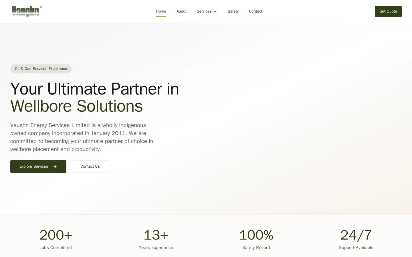
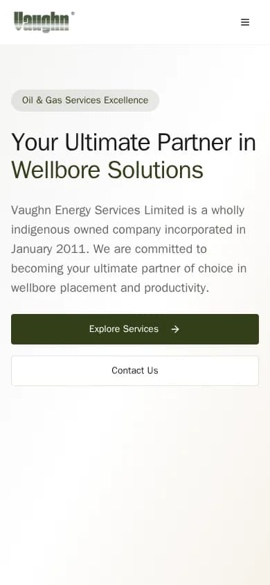
An olive, cream, and charcoal palette supports an industrial tone without overwhelming the technical copy. Large typography, generous space, compact badges, and numerical proof blocks establish a calm reading order.
Keep inquiry available throughout
The main navigation carries a persistent quote action. Service, about, safety, and careers pages return visitors to contact, and the form collects company, phone, subject, and message context for follow-up.
04/ Gallery
Inside the build
Tech stack
- React
- Cloudflare