Case study / Web development
Making healthcare staffing services easier to understand and request
- Client
- Roinuv Care
- Industry
- Healthcare
- Services
- Custom web development, UI/UX design, On-site SEO
- Platform
- Custom
- Live site
- roinuvcare.ca
01/ Results
The results
- Primary routes
- 4
- Observed 2026-09-30 · Rendered navigation: home, about, services, contact
- Staffing solution groups
- 5
- Observed 2026-09-30 · Services page inventory
- Provider types named in the core offer
- 3
- Observed 2026-09-30 · Homepage and services copy: RN, RPN, PSW
02/ Challenge
The challenge
Healthcare staffing content has to serve different visitors without becoming abstract. Facility decision-makers may need hospital, long-term-care, emergency, or customized coverage. Families may be looking for home-care support. Both audiences need to understand the available provider types, the nature of the service, and how to begin a conversation, but they do not necessarily need a large or complicated site.
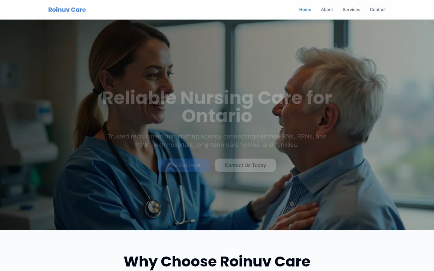
The delivered website responds with a compact four-page structure. The homepage establishes the core offer and introduces three primary service areas. The services page expands that model into five solution groups, each supported by concise descriptions and scannable inclusion lists. The about page holds company positioning, values, mission, and proof-oriented content, while the contact page keeps the next step simple through a focused message form and clearly presented contact information.
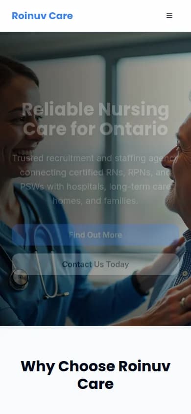
The interface uses familiar healthcare imagery, a blue-led visual system, large headings, and repeated calls to action to make the path understandable on desktop and mobile.
03/ Approach
Our approach
Clarify the audience and offer
The opening message names the provider types and the audiences they support. Visitors can determine relevance before they begin reading the detailed service content.
Expand complexity on one service page
Five staffing solution groups create enough room for hospital, long-term-care, home-care, emergency, and customized needs without fragmenting the experience into many short pages.
Use a calm, familiar interface
The blue palette, healthcare imagery, rounded action elements, and direct language create a recognizable service environment. Strong heading contrast supports scanning across longer service descriptions.
End every path with a conversation
Calls to action connect the homepage and service content to a dedicated contact page. The form collects identity, organization, contact details, and a message while keeping the request lightweight.
04/ Gallery
Inside the build
Tech stack
- React
- Cloudflare